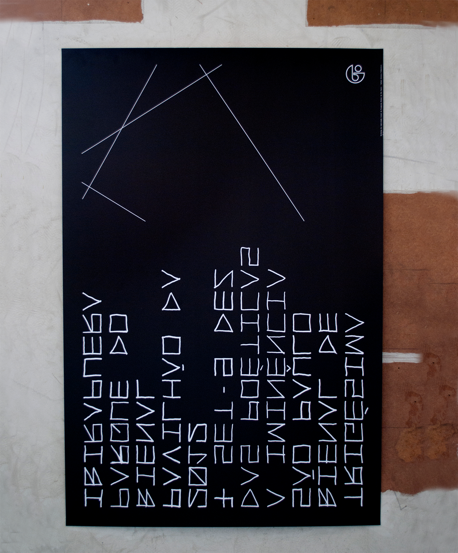
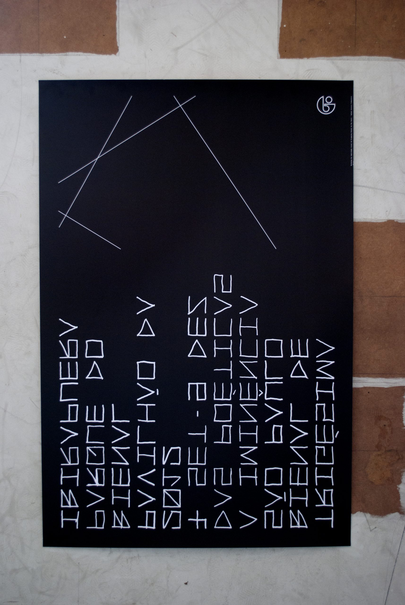
We created one of the 30 posters in 30th São Paulo Art Biennial after our director, Rafael Todeschini, was selected to be part of a workshop about collective identity creation with the edition’s curatorial and communication team. The constellation metaphor, the central point of curator Luis Pérez-Oramas’ proposal, served as a foundation for the development of ideas for the identity, spawning three principles: the black and white palette, any monospaced typography and the constellation sign.
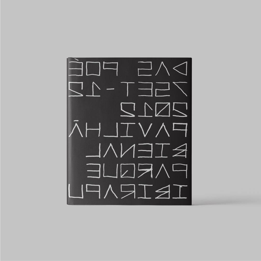
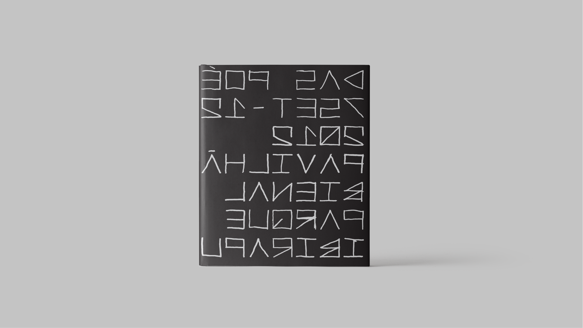
We elaborated a gestural, primitive, monospaced typography, so that on the backside of the guide text, using it from left to right and from top to bottom, the shapes created a new alphabet. We intentionally made it harder for the readers to read the information, inviting the interaction through illegibility. The posters became folded gloves for the edition’s catalogs.